When Event Branding Actually Builds Community
Let’s be real: most event branding stops at “make it look cool.” A logo. A color palette. Maybe a few social posts. Done.
But the events people remember? The ones they talk about after, come back to, bring friends to? Those don’t feel like a collection of assets. They feel like something bigger. They feel like a shared experience. And that doesn’t happen by accident.
It Starts With One Question:
Does everything feel like it belongs together?
Not just the logo. Not just the website. Everything.
📱 The way people first see the event on social
👀 The way they navigate the space
🎨 The slides, graphics, motion, details
✨ The little moments that could’ve been overlooked—but weren’t
When those pieces align, something clicks. People don’t just attend the event. They feel like they’re part of it.
The Challenge: Designing for Everyone (Without Designing for No One)
That’s exactly what we were up against with Kansas City Design Week (KCDW). KCDW brings together a wide range of disciplines: Architecture. Industrial design. UX. Graphic design. And everything in between.
Different perspectives. Different aesthetics. Different ways of thinking. So the challenge wasn’t just “make it look good.”
It was:
How do you create an identity that holds all of that (without feeling generic or watered down)?
We needed something:
Flexible enough to stretch across disciplines
Expressive enough to feel exciting
And relatable enough that everyone sees themselves in it
No small ask.
The Idea: A Shared Language for a Creative Community
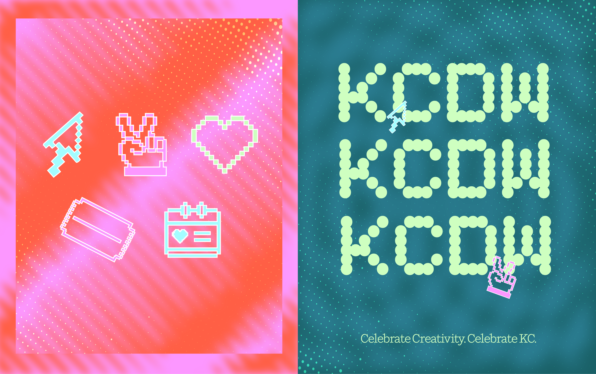
We landed on a concept rooted in the early days of digital design. Think:
Pixelated icons
Halftone patterns
Y2K-inspired typography
Bright, nostalgic color combos
A little Lizzie McGuire. A little early-internet quirkiness. A little “remember when design felt like play?” But this wasn’t about nostalgia for nostalgia’s sake. It was about creating a visual language that felt playful, but intentional. Abstract, yet recognizable. Broad enough to span disciplines, but unique enough to feel owned. Because when you’re designing for a community this diverse, you don’t pick a lane. You build something everyone can step into.
Good Design Does More Than Support An Event. It Builds It.
Here’s where most people get it wrong: They think branding sits around the event. In reality? Branding is the event.
It shapes:
How people discover it
How they move through it
How they talk about it
And how they remember it
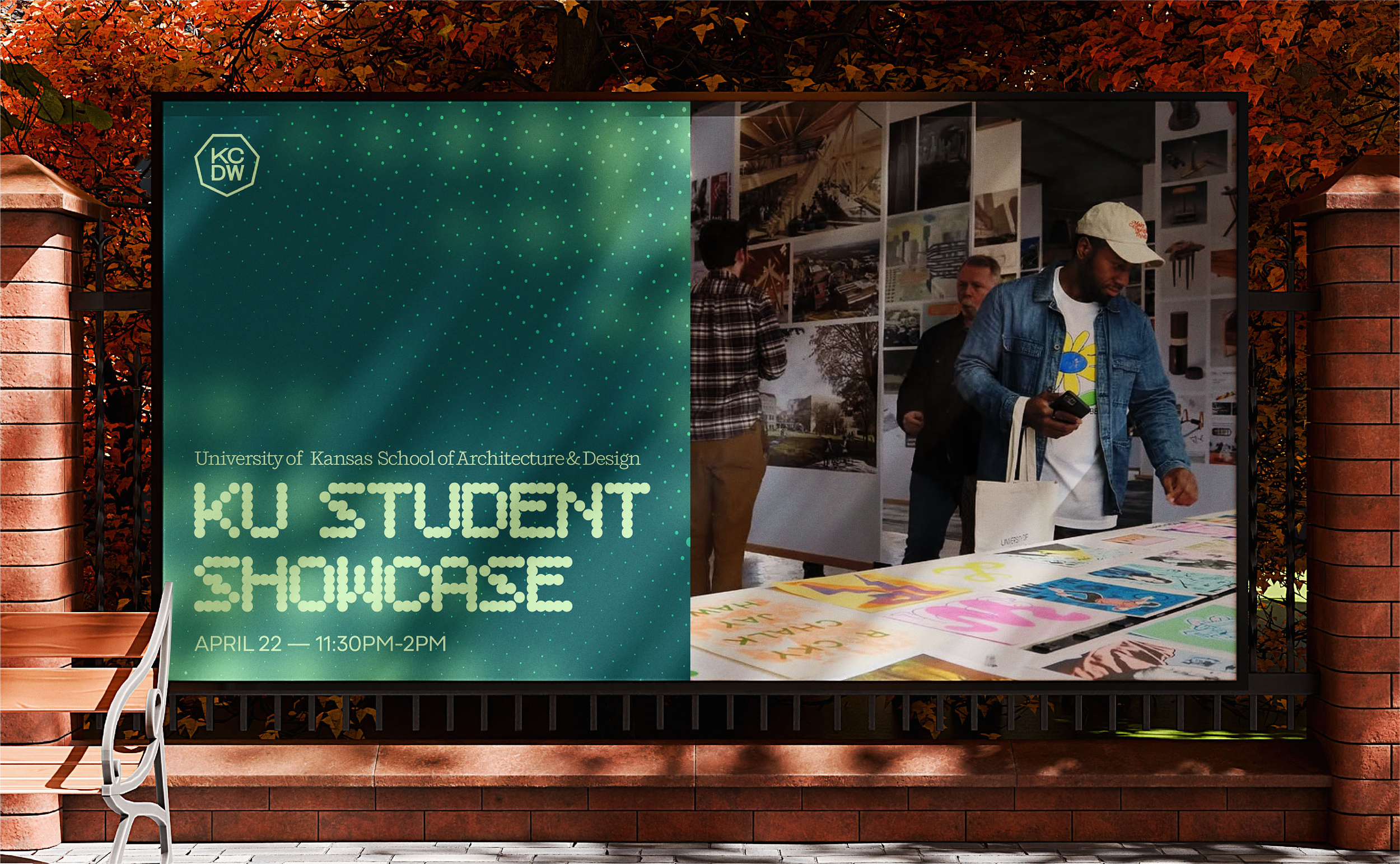
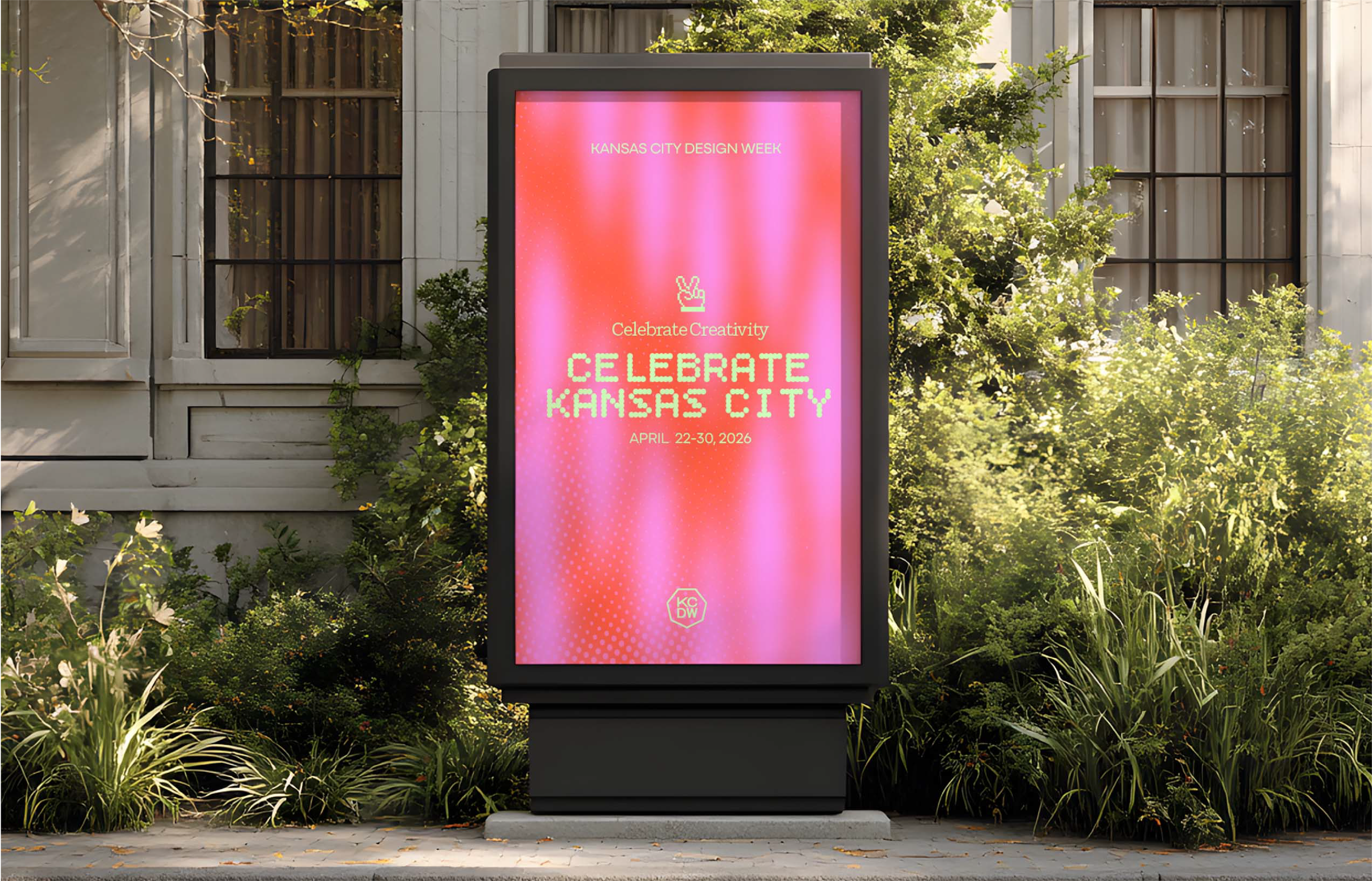
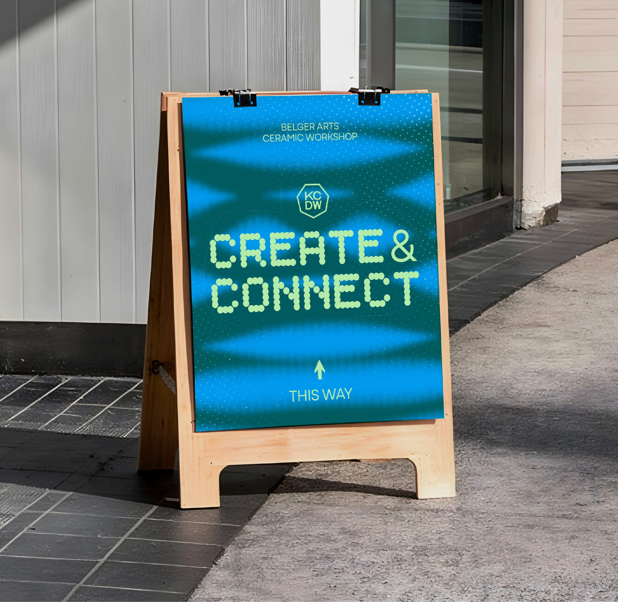
For KCDW, that meant building a system that showed up everywhere and felt consistent every time.
What We Built
Long story short: it was a full system.
Long story long: a visual language that carried through every touchpoint.
We’re talking:
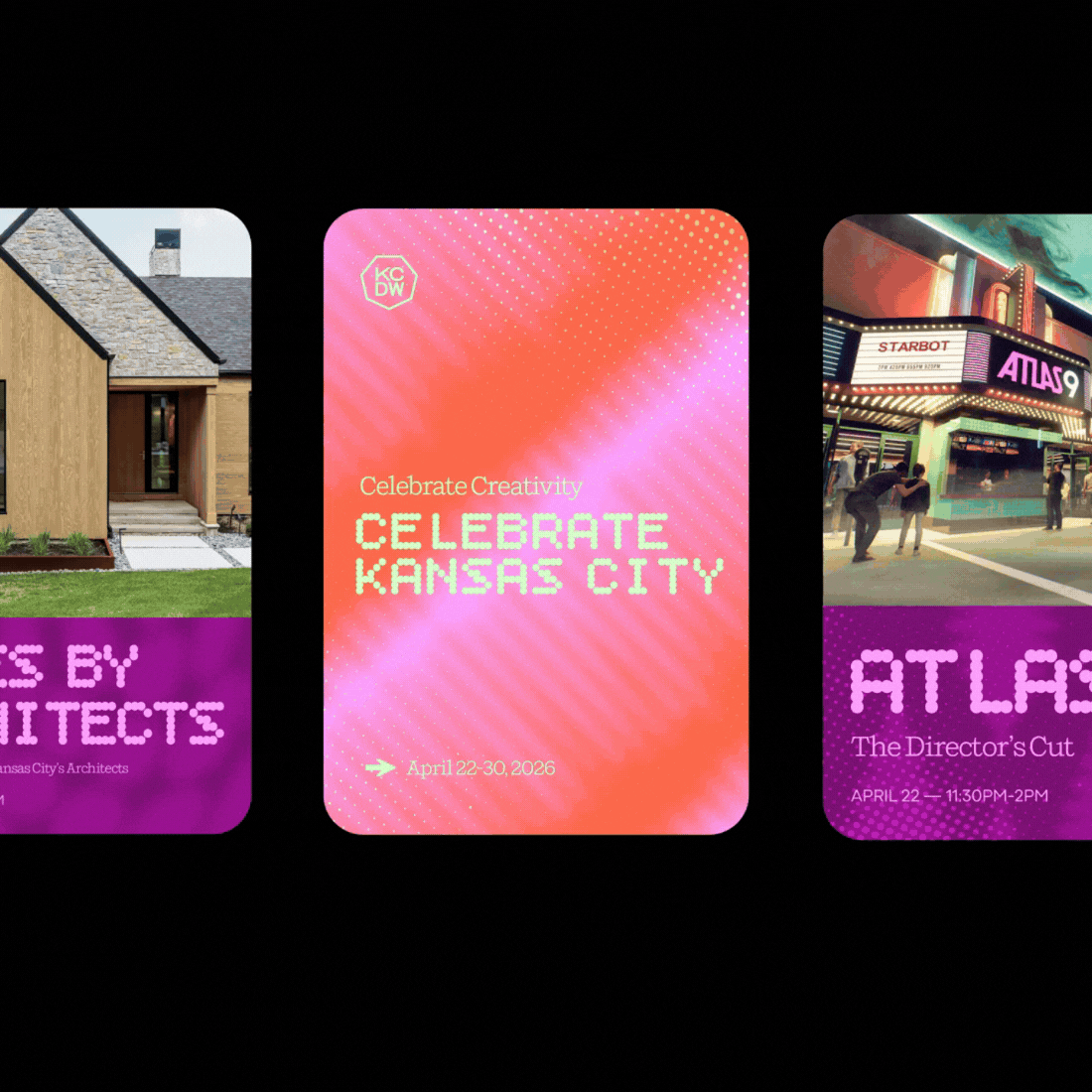
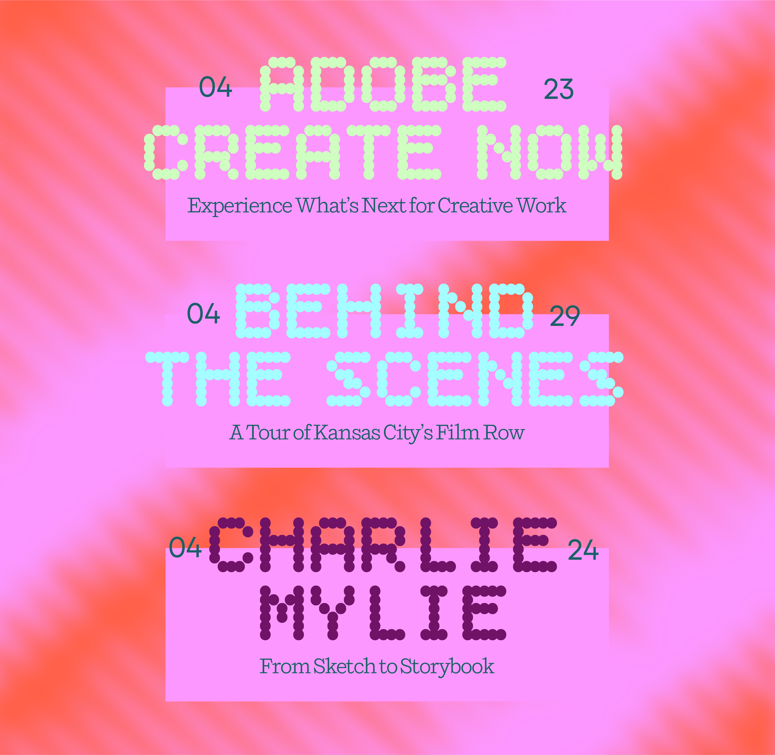
Social templates that made the event instantly recognizable in-feed
Speaker slides that felt like part of the brand, not an afterthought
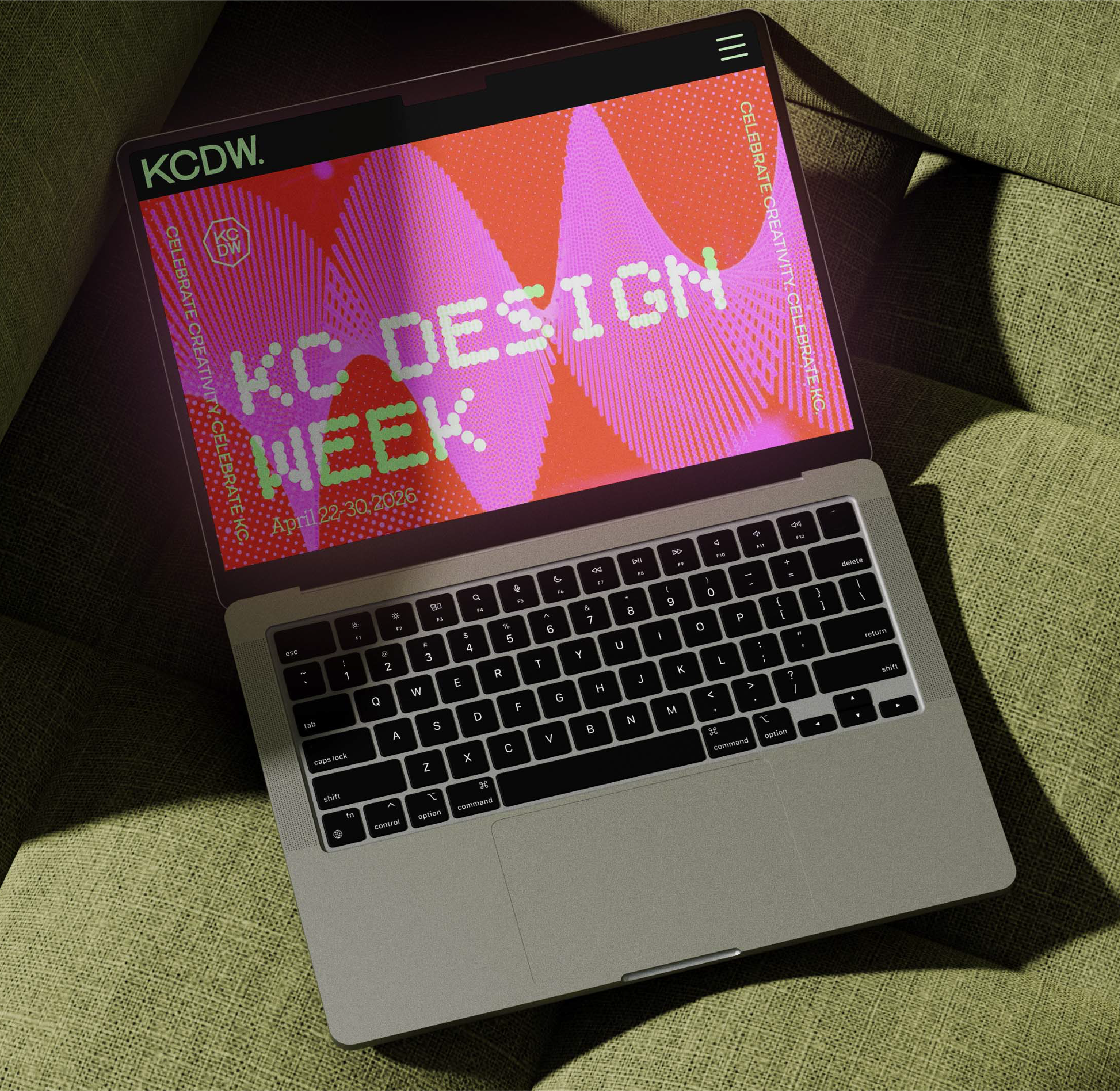
A web layout and animated banner that pulled people in before they even arrived
Custom pixel icons that added character without clutter
Pop-up banners and signage that made the physical space feel cohesive
Every piece was designed to do the same thing: reinforce the identity, without repeating it in a boring way.
The Takeaway
If you want your event to stand out, start here: Don’t think about branding as a set of assets. Think about it as a system of experiences. When every detail aligns, something bigger happens. The event stops being a schedule of sessions and starts becoming a space people want to be part of.