
Novi: Branding a New Era in Underwriting
Creating distance from an existing brand while holding onto trust and credibility
THE CLIENT + THE CHALLENGE
Lockton Affinity, a Kansas City-based underwriting group, came to us ready for a full transformation: a new name, a new brand, and a clear break from the past. While they had previously attempted to carve out a separate identity, they faced challenges with clarity and cohesion. We stepped in with a clear point of view, ready to establish a distinct presence, set the tone for what’s next, and deliver a brand built to last.
We led the team through a complete rebranding process, starting with strategic positioning and the creation of a new name: Novi. From there, we built a visual identity system that reflected their sharp, future-focused mindset, designed to stand out in a traditionally conservative space.
Novi launched as a confident, modern brand with the credibility of its Lockton roots and the clarity of a bold, new beginning. Fresh name, focused vision, built to make waves.
WHAT WE DID
Naming Exploration
Verbal Identity
Visual Identity
Brand Strategy
INDUSTRY
Insurance

Strategic Positioning
Our goal was to build a verbal identity that felt both intentional and enduring. We began with research and discovery—digging into the company, the competitive landscape, audience behaviors, and the brand’s own aspirations. From there, we translated insights into clear strategic positioning that defined Novi’s unique place in the market.
The verbal identity included development of brand personality, voice and tone, key messaging by audience segments, and tagline options. Supporting copywriting like a definied “About Us” description was created to help guide internal teams and give guidance on how to continue to maintain the Novi voice. The result is more than just words—it’s a cohesive voice that consistently communicates Novi’s actionable and forward-thinking approach and brings the brand to life across every touchpoint.
DELIVERABLES
Brand Persona + Personality
Brand Voice
Key Messaging by Audience
Tagline Options


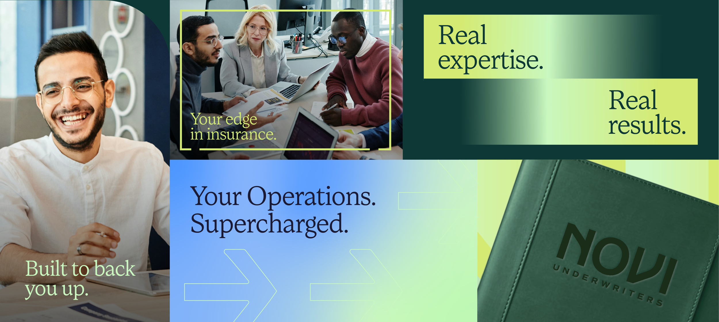
Creative Execution
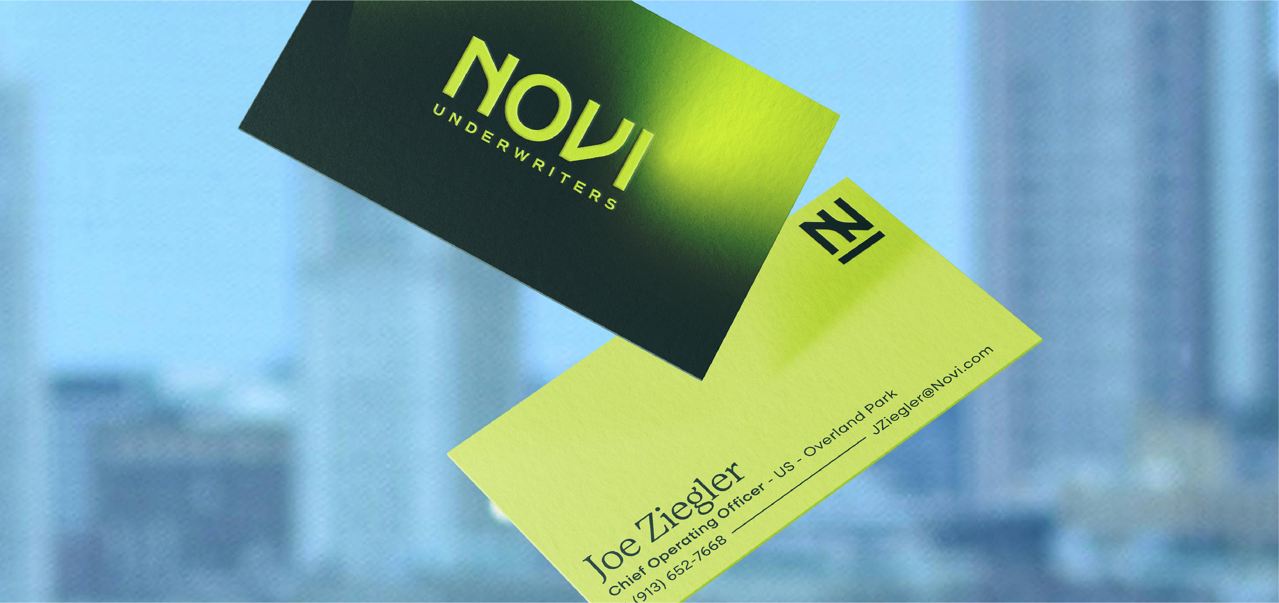
A new brand like Novi requires establishing a solid foundation for a consistent visual presence.
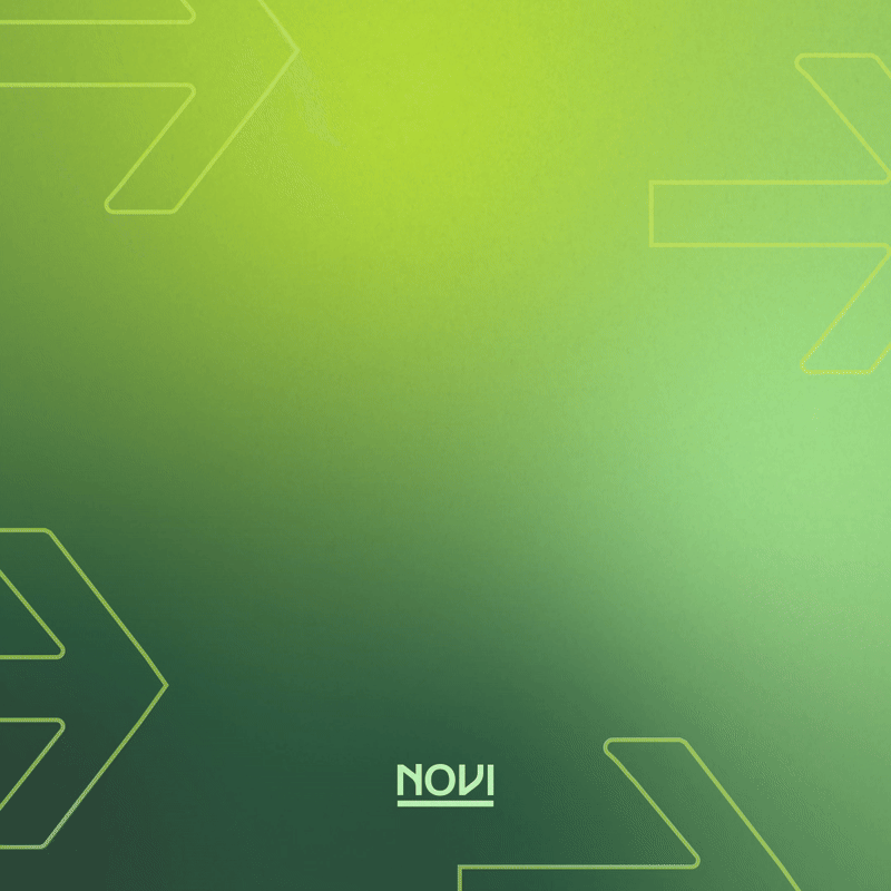
The logo leads with confidence, with the curved "N" symbolizing connection, flow, and forward motion. Its smooth lines reflect a sense of innovation and clarity, setting the tone for the broader identity. You’ll spot echoes of that curve, along with other elements within the logo (hint: our square frame) throughout that tie everything together and give the whole system a sense of motion (and a wink of personality).
Bold, vibrant colors bring Novi’s identity to life—starting with a fresh green that nods to new beginnings (and its Latin namesake). Supporting tones step in to keep things grounded and balanced, making sure it’s not all energy, all the time. Smooth gradients add just the right amount of depth and dimension, giving the brand a modern edge and a sense of momentum in a space that’s usually anything but bold.
Identifying a typography system helps establish hierarchy for future marketing and design efforts, helping messaging stand out in an impactful way and allowing viewers to easily navigate useful information.
DELIVERABLES
Comprehensive Logo Suite
Defined Color Palette
Supporting Elements
Typography Hierarchy
Guiding Application Examples


FROM THE CLIENT
“First, we’d like to say thank you for all the hard work your team has put into these names. As a copywriter, I know firsthand how much thought, research and discussion went into these names. So, a big thanks to Shanley and whole team.”