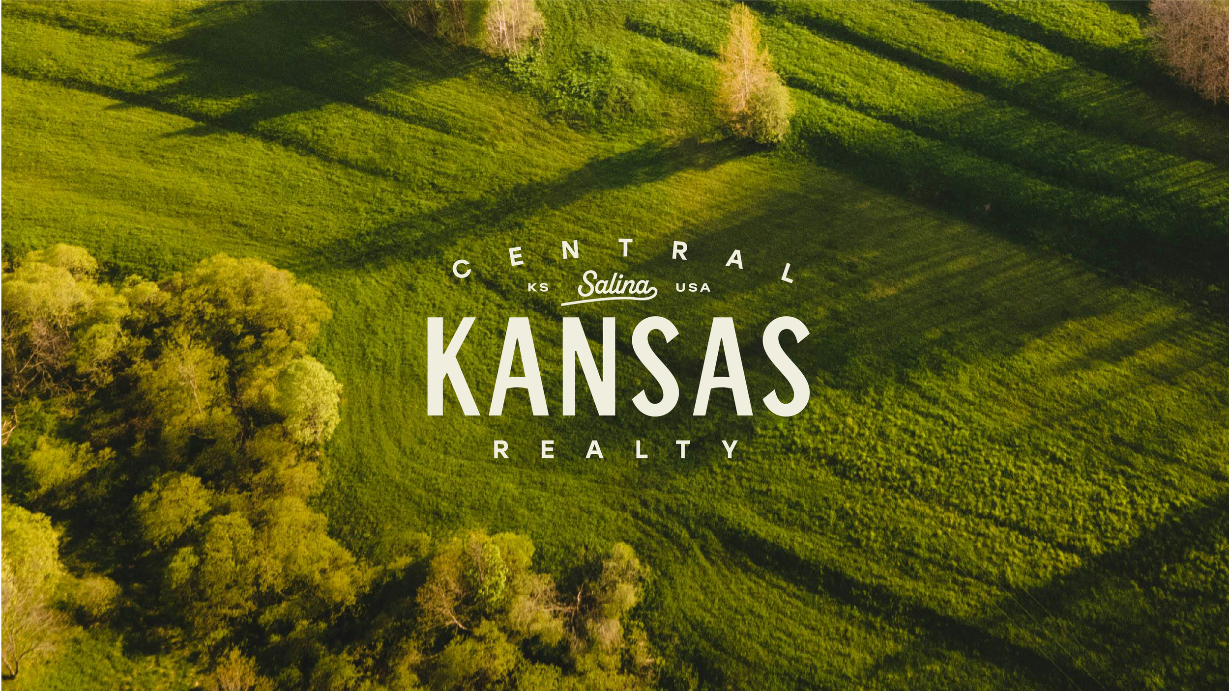
Central Kansas Realty
project type
Brand Identity
Industry
Real Estate
Completed
2025
Meet the client
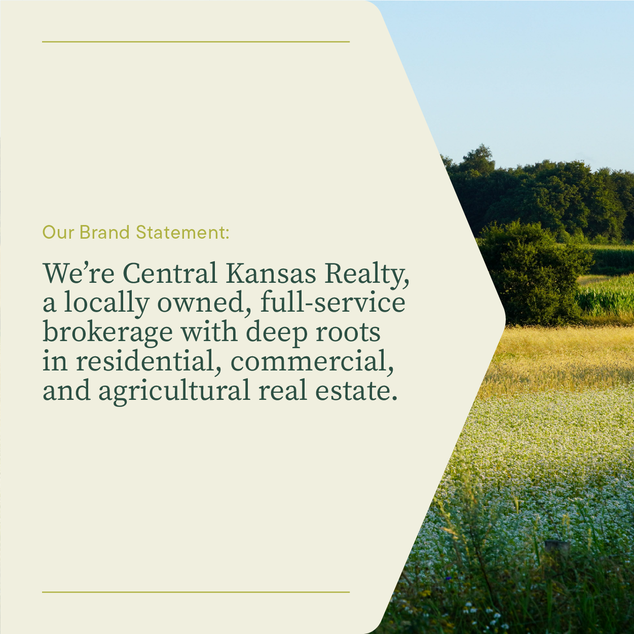
Central Kansas Realty is a full-service real estate brokerage serving residential, commercial, and agricultural clients across Central Kansas. They’re the kind of team that knows the land, knows the people, and knows that relationships matter more than buzzwords. In other words: local in the truest sense.
What We Did
Brand Strategy
Verbal Strategy
Visual Identity
Launch Strategy
the ask
The transition away from a national franchise came with a big opportunity…and a big responsibility.
Central Kansas Realty wanted to:
Establish a new, independent brand
Keep the trust they’d earned over decades
Create a clear, consistent identity that felt timeless—not trendy
Launch in a way that reassured their community: we’re still us—just on our own terms now
The challenge? Make something new feel instantly familiar.
WHAT WE DID
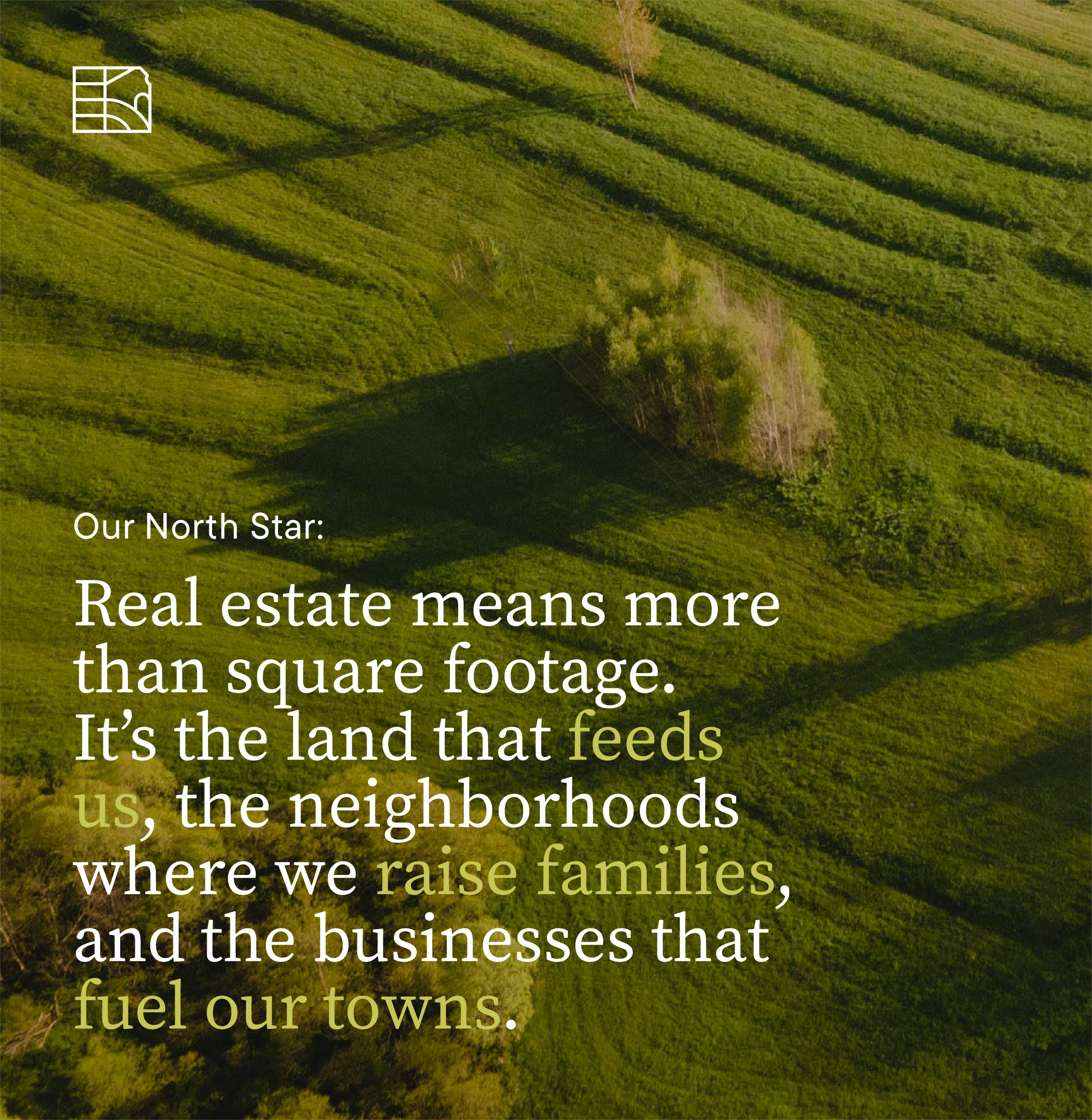
We started where we always do: listening. To their history. Their values. Their people. Their place. From there, we built a brand that feels grounded, confident, and human (because that’s how Central Kansas Realty shows up every day).
A Voice That Sounds Like Home
We gave Central Kansas Realty a verbal identity that trades corporate real estate jargon for clear, conversational language. The kind that feels natural coming from an agent who actually lives where they work.
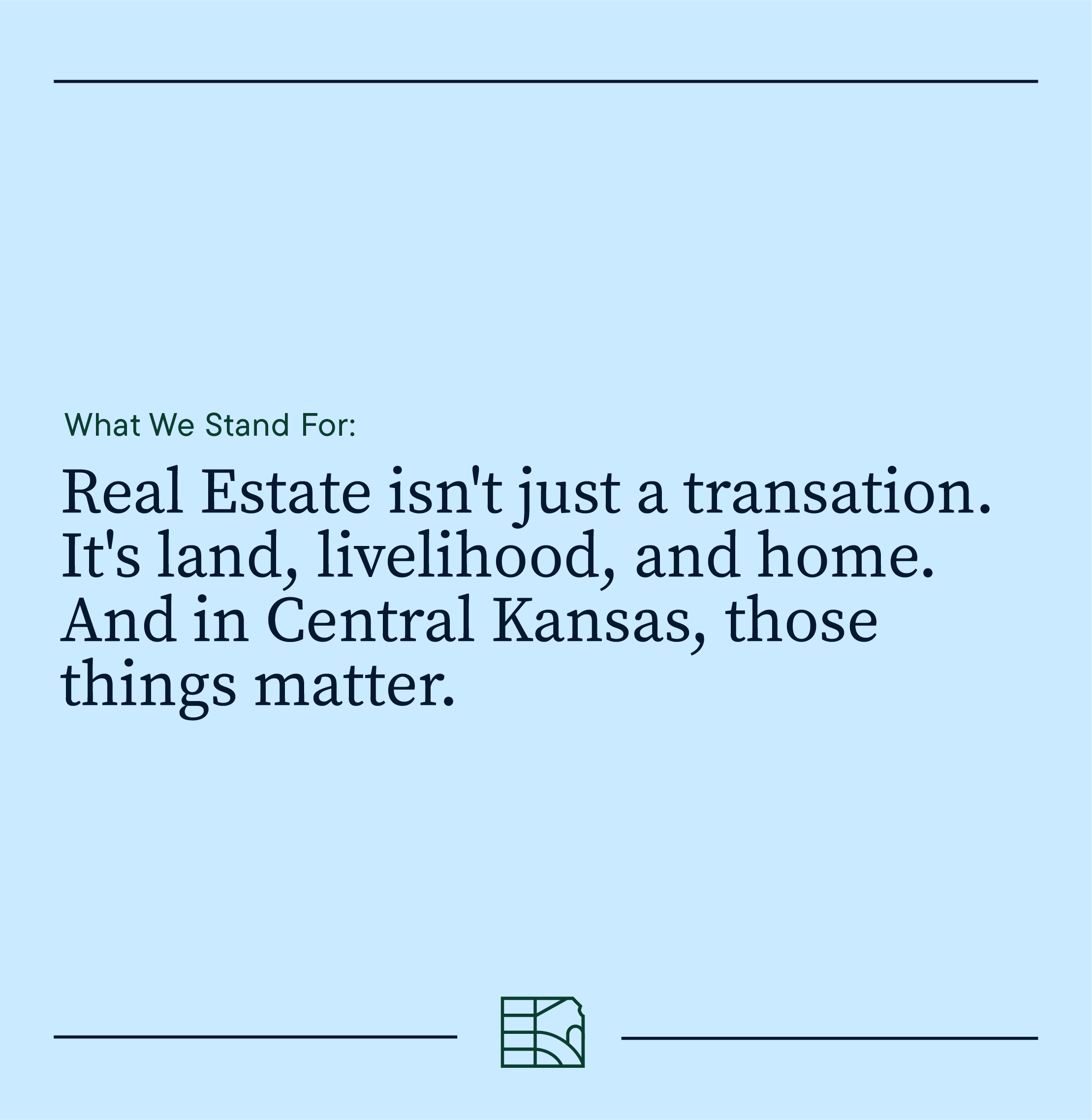
The new messaging centers on pride of place, long-term relationships, and showing up consistently.
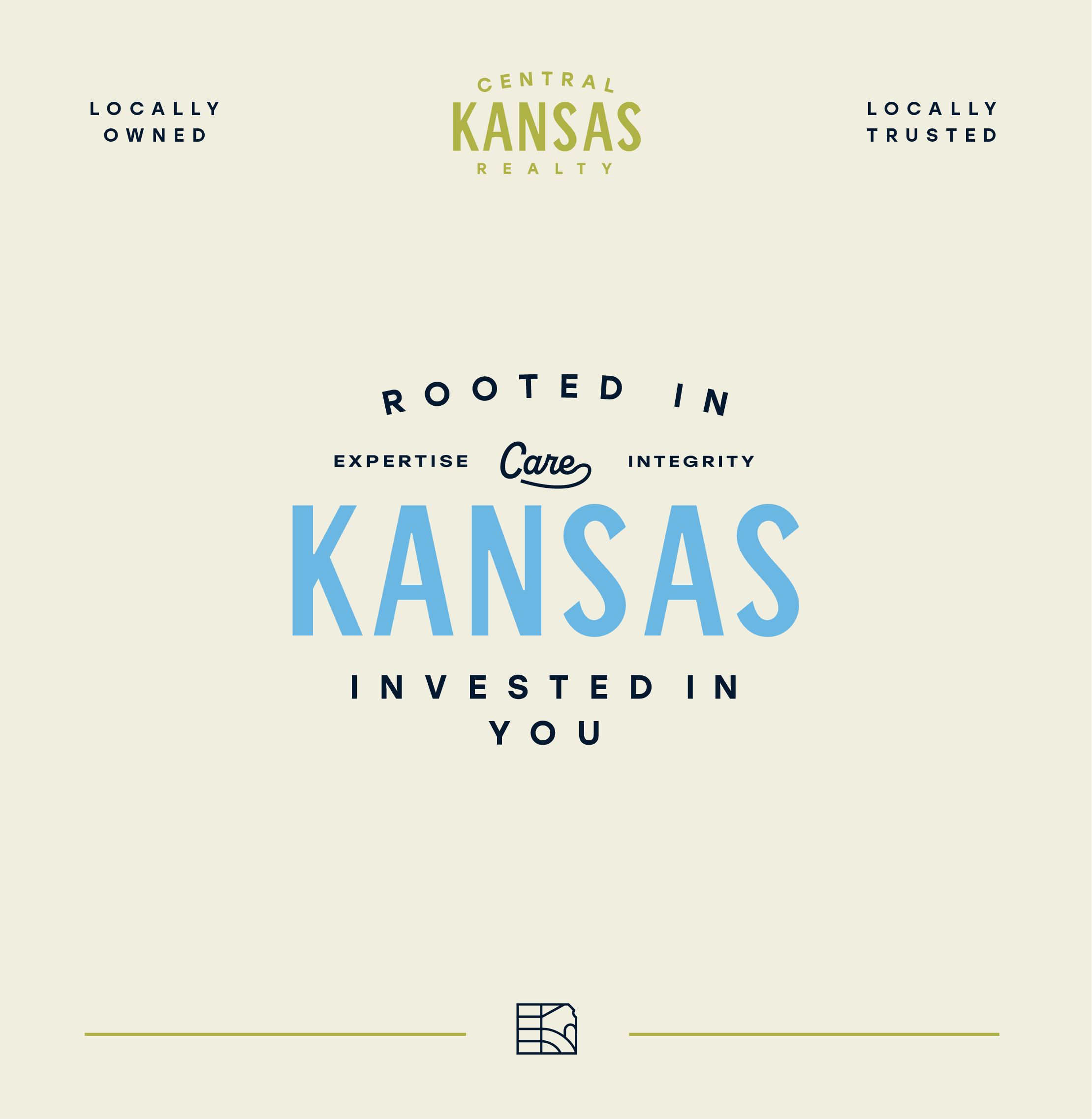
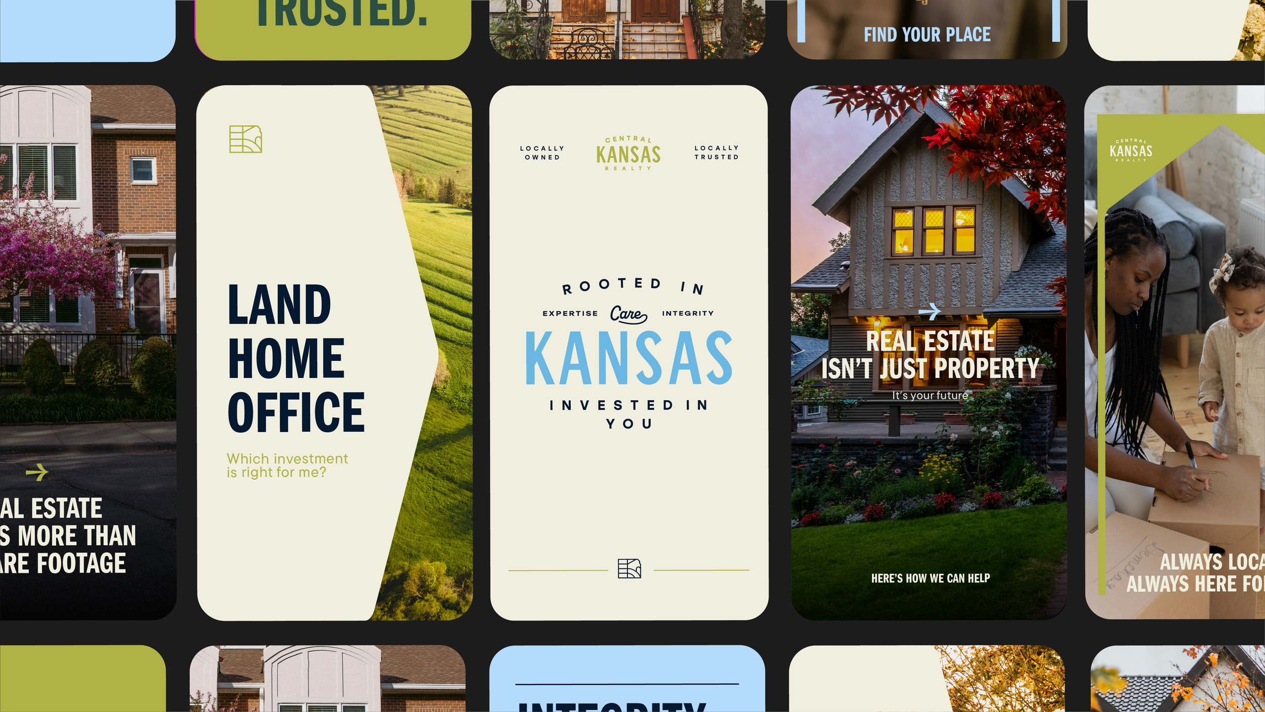
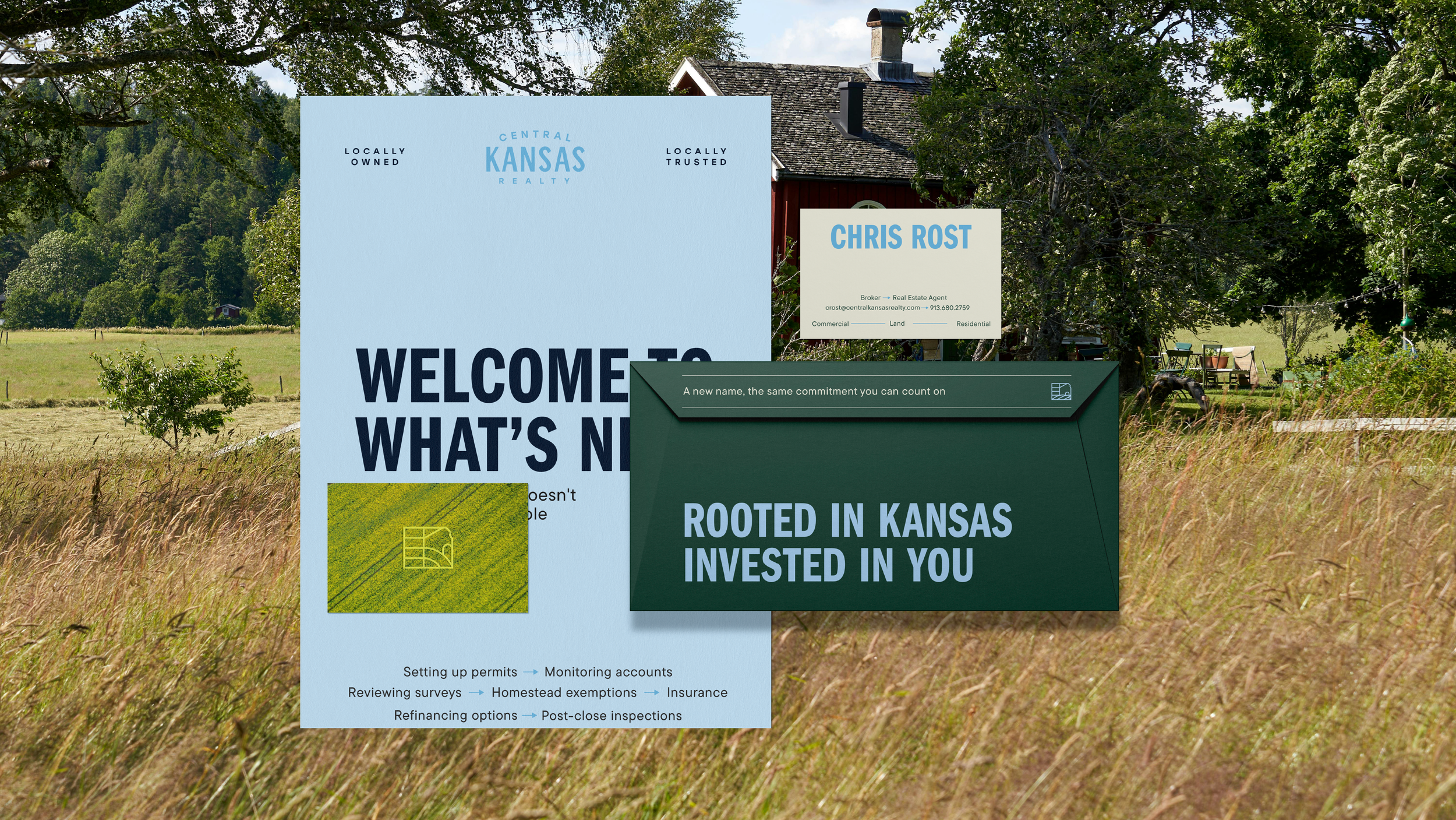
That’s where the tagline came in: Rooted in Kansas. Invested in You.
It’s not marketing fluff. It’s a promise.
Supporting phrases like “Always local. Always here for you.” reinforce that sense of reliability and connection—internally for agents, and externally for clients.
We also developed launch language across email, postcards, and social to help the brand debut confidently without over-explaining itself.

A Visual Identity That Feels Steady (in a Good Way)
Visually, the brand needed to feel established but not stuck.
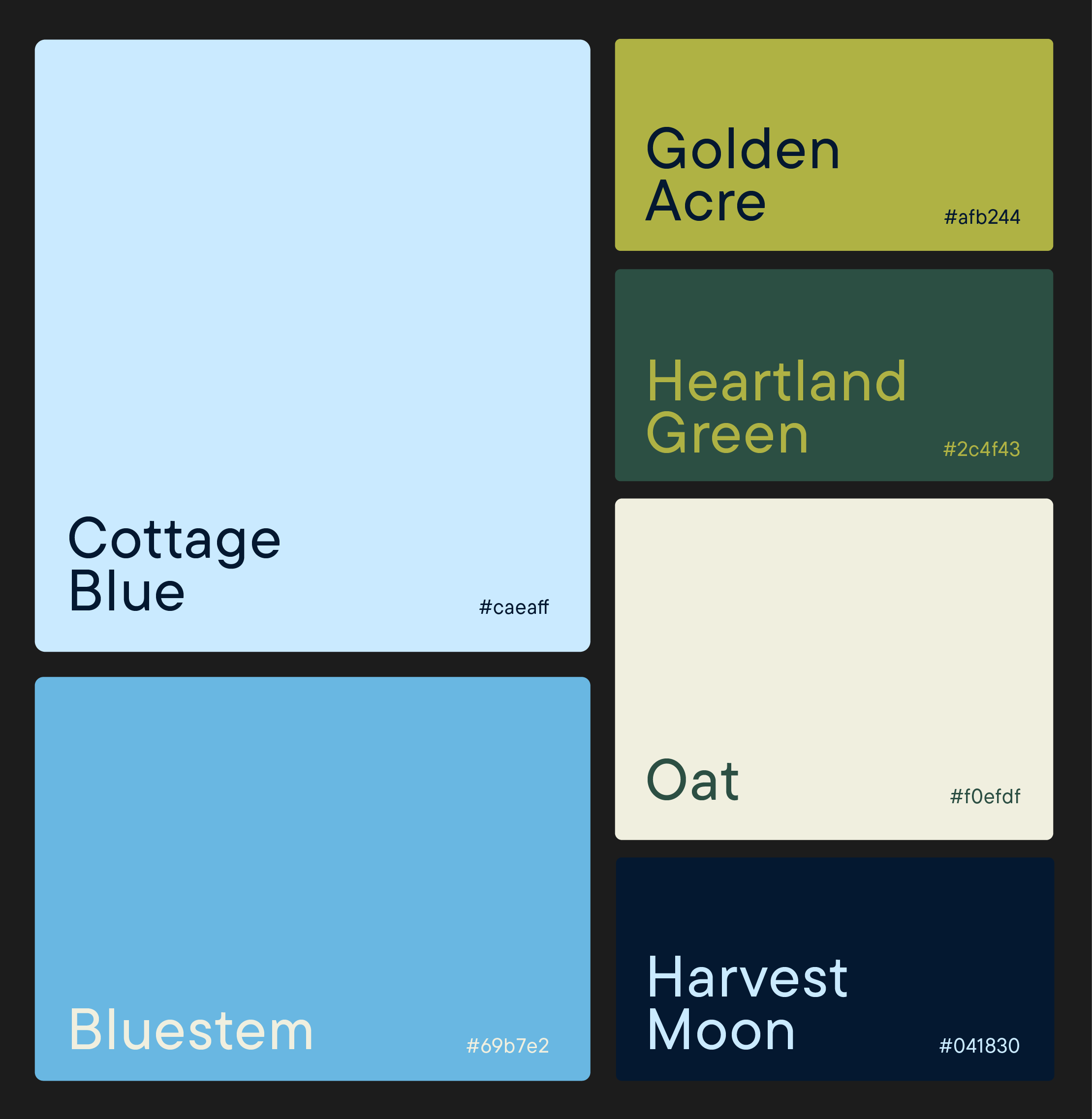
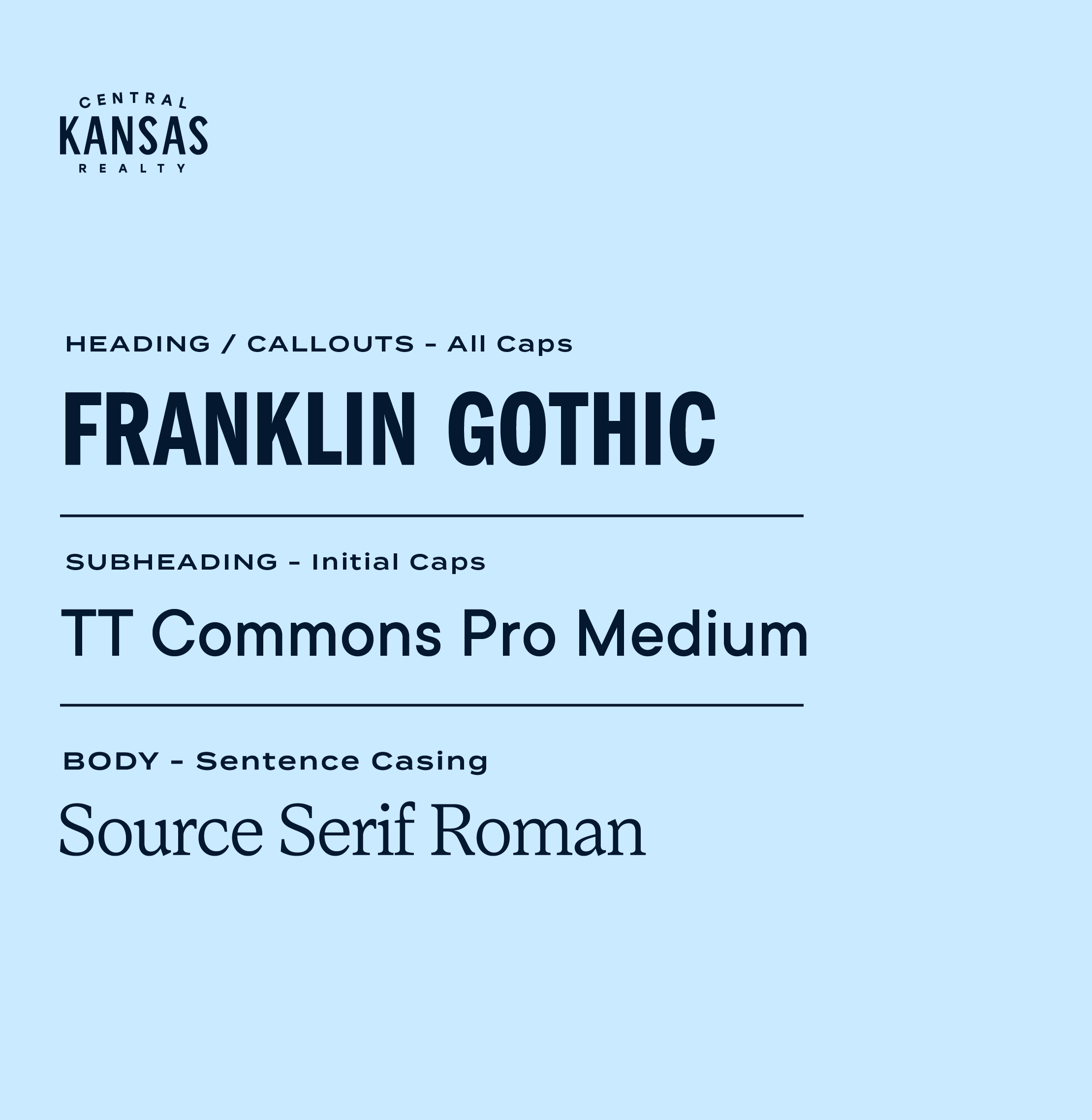
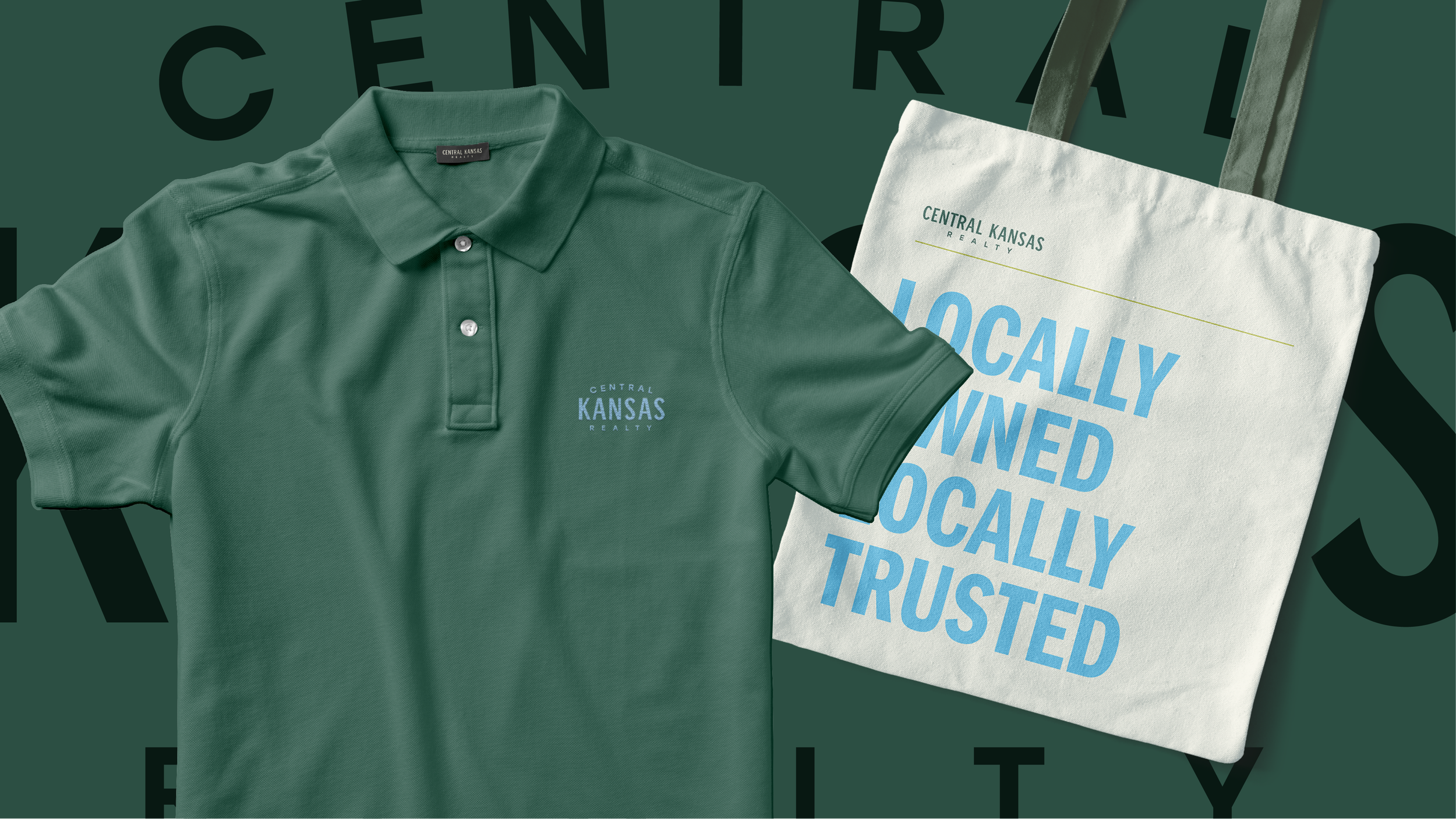
The logo system is bold, clean, and flexible, with multiple marks that work across signage, print, digital, and agent materials. The typography is confident and straightforward. The iconography nods to the Kansas landscape and built environment without getting literal or kitschy.
The color palette does a lot of quiet heavy lifting: grounded blues, greens, and neutrals that signal trust, stability, and connection to the land—whether that land holds a home, a business, or a wide-open field.
Everything works together to say: We’re solid. We’re local. We’re not going anywhere.


the result
Central Kansas Realty launched with a brand that feels both new and deeply familiar.
One that honors their history without being defined by it.
One that gives agents language they’re proud to use.
One that shows their community they didn’t leave—they simply stepped into their own.
A brand built to last. Just like the relationships behind it.