Ready to Talk Like A Branding Pro?
If you’ve worked with us (or even lurked around our content), you’ve probably heard some marketing and branding jargon thrown around. We promise—we’re not trying to sound fancy. These terms are the building blocks of what we do, and knowing them helps you understand why we make certain design and strategy choices.
So, let’s break it down.
Branding Lingo, Decoded
Brand Identity
Think of this as your brand’s fingerprint. It’s everything people see and recognize about your brand—from your logo and colors to fonts and photography style. It’s what makes you you.
🔎 Real-world example
If you removed the logo from a Starbucks cup, you’d still know it’s Starbucks. That’s strong brand identity.

Brand Voice
How your brand sounds in writing. Whether it’s witty and playful (like us) or polished and professional, brand voice is the personality behind your messaging.
🔎 Real-world example
Think Wendy’s Twitter account. Their voice is bold, sassy, and totally unforgettable.

Visual Hierarchy
A fancy way of saying what grabs your attention first. Designers use size, color, and placement to guide your eyes so you focus on the most important elements first.
🔎 Real-world example
That “BUY NOW” button in bright red? Not an accident.

Negative Space
Also called white space, this is the empty space around design elements. It’s not wasted space—it’s breathing room that makes everything look intentional and polished.
🔎 Real-world example
The Apple logo. Simple. Clean. Uncluttered.

Call to Action (CTA)
A clear, direct statement that tells your audience exactly what to do next—whether that’s clicking a button, signing up for a newsletter, or buying something.
🔎 Real-world example
“Add to Cart” or “Let’s Get Started” buttons? Those are CTAs in action.

Typography Pairing
The art of choosing fonts that look good together. A well-paired serif and sans-serif? Chef’s kiss.
🔎 Real-world example
Think about how Vogue’s logo pairs bold, classic serif typography with modern fonts inside the magazine.

Conversion Rate
The percentage of people who take action after visiting your site, seeing your ad, or clicking your email. More conversions = better results.
🔎 Real-world example
If 100 people visit your website and 5 make a purchase, your conversion rate is 5%. (And we’re here to help make that number bigger.)

Kerned to Perfection
Kerning is the space between letters. Bad kerning? Let’s just say it can create some unfortunate design fails.
🔎 Real-world example
Google “kerning fails” and prepare to cringe. (What kind of lights?!)

The Takeaway?
Knowing these terms helps you navigate the branding world with confidence—because when you understand the strategy behind the design, you can make smarter brand decisions.
Project Spotlight
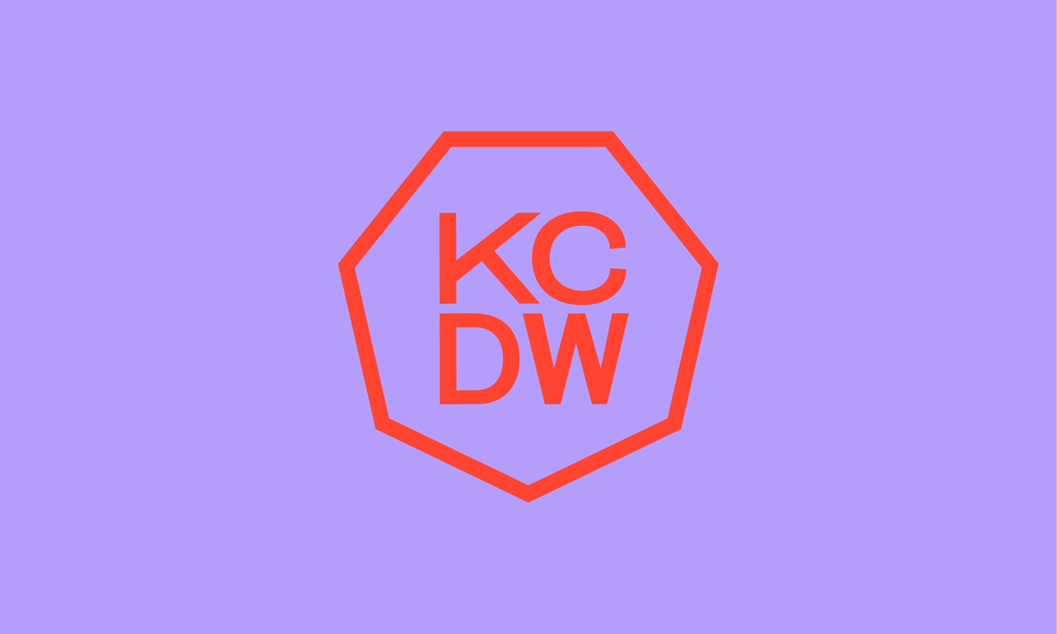
KC Design Week
Even the most creative brands need a refresh. When KC Design Week came to us, they needed a bold, cohesive brand that captured the energy of their event while standing out in a city full of creatives.
Here’s what we delivered:
A refreshed, dynamic main logo that commands attention while maintaining brand standards
Alternative logos built for social, stamps, and beyond
A bold, high-impact color palette celebrating creativity
Custom illustrations to bring the brand to life
Signature gradients and patterns to add depth and dimension
Social content and templates designed to actually get noticed
The result? A brand system that doesn’t just look good—it works. It tells a story. It unites designers, creators, and innovators under one bold visual identity.